
I posted a B/W (monochrome) shot on Flickr a few weeks back and mentioned that I’d used a particular B&W color filter effect to get it right. Later, it occurred to me that not everybody might know what I meant by that; how it works. So, while I’m no big expert filters, I kind of like explaining stuff… and that was the tipping point which motivated starting this blog. Here, then is what I wanted to mention about filters:
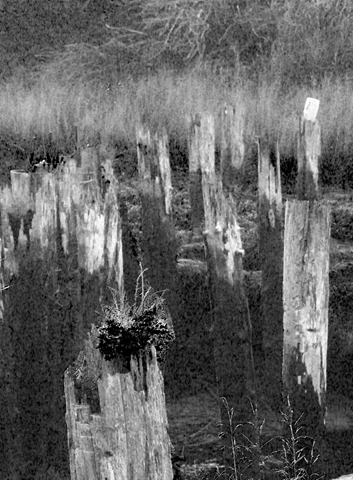
This is the photo I put up on Flickr.
The sun illuminated the scene very strongly from the left, while the sky overhead was intense dark-blue (dawn blue), casting the scene in shade. Now notice that I said “casting … in shade”. Most of us think of shade as the absence of sunlight, forgetting that something is reflecting light onto the scene otherwise it would be inky blank. That reflected light is what we call “shade”. And shade has color. Actually, it has lots of colors from all the many things reflecting – casting – their light where the sun don’t shine. Shade is both complex and diffuse; that’s where the action is.
In contrast, sunlight comes from a point light source and is unvarying in its spectral makeup; along with being intense, it is consistent and concentrated. In the realm of B&W photography, sunlight is very, very bright and very white; everything else down to jet black is diffused and some shade of gray. Because the shade of gray you see is based on it’s color, colored filters can be used to alter the relative brightnesses among objects or areas in a scene.
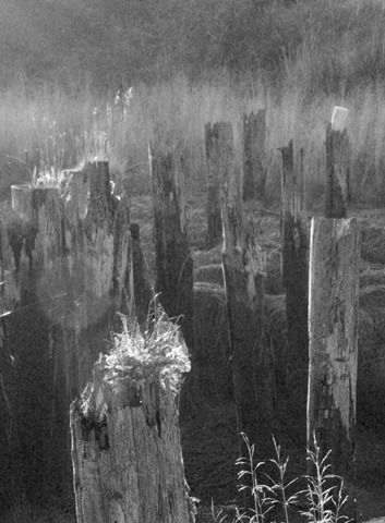
 This is the original color exposure, straight out of the camera. It was beautiful, but to me, color really didn’t capture the mood – what I felt – standing there. Then it hit me; color was actually obscuring the the quality of the light!
The overall contrast is very high, but large areas are very soft; in the back, where the grey pilings meet the yellowish tan grass, the brightness of the grasses and pilings are quite similar, but the colors are different, and color differences can be converted to brightness differences with filters.
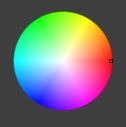
The Color Wheel
The color wheel is your friend. It unlocks the “secret” of filters, which is this:
 A filter of a color on one side of the wheel reduces the apparent brightness of the color on the other side.
Get that? Reduces the color on the other side.
Take a look at that wheel on the right.
There’s a little ‘pip’ on the right where it’s red, marking this as being a “red” filter. Now, notice that right across from red on the other side of the color wheel is what? Sky Blue (cyan actually). So, in B&W photography, what does a red filter do? It reduces the brightness of the sky colors. It can turn the sky black (as in Ansel Adams’ famous shot of Half Dome).
So, look around the edge of the color wheel at the various colors and imagine those colors in nature. You see; blue sky, green foliage, orange sunsets, skin tones, etc. You can adjust the relative brightness of these in a B&W photo by using a filter of the color on the opposite side of the wheel.
That’s pretty much all you need to know
Examples:
When thinking about filter colors, in the field on on a computer screen in processing, you have to start by considering the color – the visual color, the actual color of the things in the scene. As I’m sure you know, something which is pure white in bright sunlight appears orange-ish in a room lit by incandescent bulbs. That’s why we set the white balance in camera; so that a “white” thing appears “white” when the image is viewed. The color you see is the color of the light source, less the colors the object absorbs (rather than reflecting). So, different color source, different color seen.
Outside in daylight there are two primary light sources (neglecting things like fill flash): sunlight, and sunlight reflected off of something else. The something elses absorb some of the colors from the sun and reflect the rest. Hence “blue sky” (aka shade) is a common second light source.


Summary
As you can see, filters give you enormous control over the relative brightnesses in a scene. Results vary from subtle to dramatic. Which to use? Depends on your intent. More subtle effects heighten realism – accentuate what was seen and/or felt while remaining true to “reality”. Other filters can be used to explore the hidden world – the relationships we never see in “reality”; shade can become more dramatic than the brightly lit portions of the original scene.
NOTE: The color wheel shots are screen captures from Lightzone, a photo processing tool I use frequently. You can grab and drag that little “pip” on the color wheel to any part of the wheel and see the results instantly; download the free trial and try this out on your own photos.
Leave a Reply